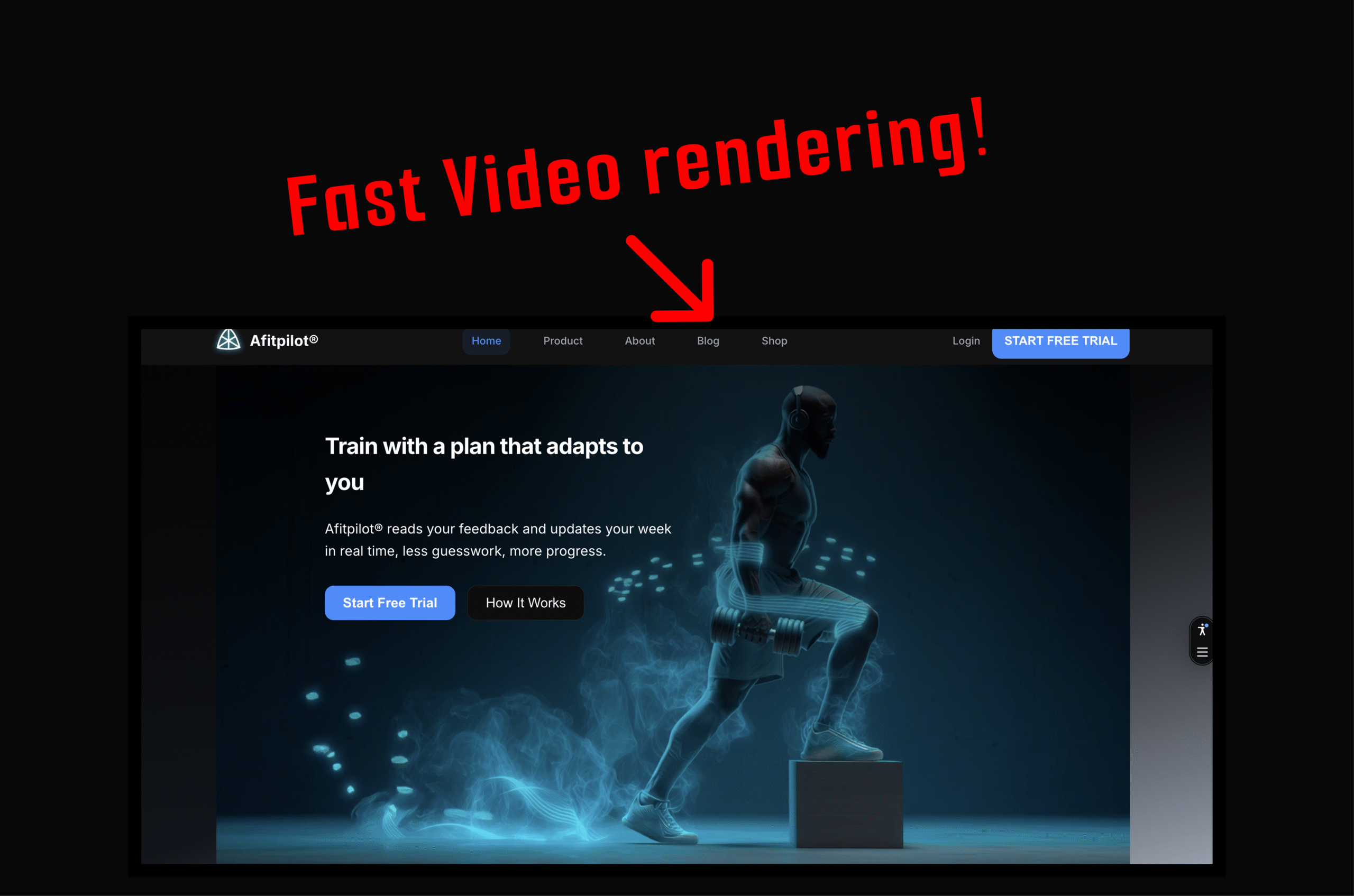
Every page on Afitpilot opens with a full-bleed looping background video. It sets the tone immediately: athletes in motion, intent, energy.
But for too long, users were greeted with something else entirely.
A black rectangle.
On cold loads, especially over mobile connections, the hero section stayed empty for seconds before anything appeared. No motion. No visual anchor. Just a dark void where the first impression should have been.
This is how we diagnosed the problem, why it happened, and how we shipped a fix that delivers an immediate visual on every page load.
The symptoms
On a cold load over a typical 4G connection:
- The hero section rendered as an empty black block for 2–4 seconds
- The gradient background appeared, but the
<video>element was not in the DOM yet - On mobile, both desktop and mobile videos were downloaded simultaneously, even though only one was ever displayed
The experience was worst on slower connections. The page technically loaded, but visually it felt broken.
The root cause
Afitpilot is built with Nuxt 3 using server-side rendering.
The hero video was gated behind two reactive conditions:
<template v-if="!prefersReducedMotion && isInView">
  <video class="hidden md:block ...">
    <source src="/home_page_desktop.mp4" />
  </video>
  <video class="block md:hidden ...">
    <source src="/home_page_mobile.mp4" />
  </video>
</template>
Both prefersReducedMotion and isInView are client-only values.
During SSR:
prefersReducedMotiondefaults totrueisInViewdefaults tofalse
That means the <video> element does not exist in the initial HTML at all.
It only mounts after hydration and after the IntersectionObserver fires, which can take several seconds on real networks. Until then, the hero is empty.
There was a second, more subtle problem.
Even when the video did mount, both variants mounted at once:
- Desktop video (3.8 MB)
- Mobile video (4.8 MB)
CSS (hidden md:block / block md:hidden) hid the wrong one visually, but the browser still downloaded both files.
On the homepage alone, that meant over 8 MB fetched for a 5-second loop.
The fix: three changes
1. Single-variant rendering with useBreakpoint
We replaced CSS-based responsive hiding with a Vue composable that uses matchMedia to determine the viewport at runtime.
export function useBreakpoint() {
  const isDesktop = ref(true) // SSR default: desktop

  onMounted(() => {
    const mq = window.matchMedia('(min-width: 768px)')
    isDesktop.value = mq.matches
    mq.addEventListener('change', (e) => {
      isDesktop.value = e.matches
    })
  })

  return { isDesktop }
}
The template now mounts exactly one video:
<template v-if="isDesktop">
  <video src="/home_page_desktop.mp4" ... />
</template>
<template v-else>
  <video src="/home_page_mobile.mp4" ... />
</template>
No CSS tricks. No hidden elements. One <video> tag, one download.
Mobile users fetch the mobile video. Desktop users fetch the desktop video. Nothing else.
2. Poster-first loading
The hero now renders a static poster image immediately, with the video loading behind it.
<img
  src="/home_page_desktop.webp"
  class="hero-poster"
  :class="{ 'hero-poster--hidden': heroVideoReady }"
  loading="eager"
  fetchpriority="high"
/>

<video
  class="hero-video"
  :class="{ 'hero-video--hidden': !heroVideoReady }"
  @canplay="heroVideoReady = true"
  autoplay
  muted
  loop
  playsinline
  preload="auto"
>
  <source src="/home_page_desktop.mp4" type="video/mp4" />
</video>
When the video fires canplay, we cross-fade from poster to video with a 0.3s opacity transition.
The result:
- Instant visual feedback on first paint
- Smooth, deliberate transition
- No jarring pop-in
A .webp poster is a fraction of the video size. It is cheap insurance for perceived performance.
3. CSS-only reduced motion
Previously, reduced-motion handling happened in JavaScript. That meant the video had to mount before we could decide to hide it.
Now it is pure CSS:
@media (prefers-reduced-motion: reduce) {
  .hero-video {
    display: none !important;
  }
}
If a user prefers reduced motion:
- The video is never displayed
- The video is never downloaded
- The poster remains as a static hero background
No JS checks. No hydration edge cases. No wasted bytes.
What we removed
This mattered as much as what we added.
useMotionPreferencecomposable
Replaced by a CSS media queryuseInViewcomposable
IntersectionObserver was the primary cause of delayed rendering. Above-the-fold heroes should not be lazy-loaded.preload="metadata"
Changed topreload="auto"so the browser starts fetching immediately- Double video elements
Each page now mounts one and only one<video>
The result
| Metric | Before | After |
|---|---|---|
| Time to first visual | 2–4 seconds | Immediate (poster image) |
| Videos downloaded per page | 2 (desktop + mobile) | 1 |
| Bytes wasted on mobile | ~3.8 MB | 0 |
| Reduced motion behavior | JS-gated, video still mounts | CSS-only, video never loads |
| SSR HTML contains hero visual | No | Yes (poster <img>) |
The hero now shows meaningful content on the very first paint. The video fades in when ready. Mobile users download roughly half the data they used to. Reduced-motion users get a clean static image with zero unnecessary network requests.
Lessons learned
Do not gate above-the-fold content on client-only state.
IntersectionObserver is for content below the fold. Heroes belong in the initial HTML.
Use v-if to prevent downloads, not CSS.display: none, hidden md:block, and similar utilities do not stop the browser from fetching media. Removing the element from the DOM does.
Poster images are cheap insurance.
A few hundred kilobytes buys you instant perceived performance and a smoother experience.
Prefer CSS over JavaScript for media queries.prefers-reduced-motion in CSS is simpler, more reliable, and avoids SSR hydration timing issues entirely.
Leave a Reply
You must be logged in to post a comment.