
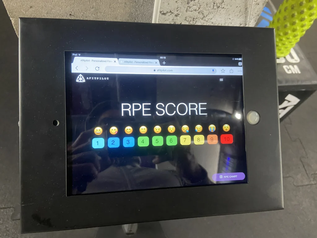
Three years ago I set up an RPE kiosk at a CrossFit box where I was coaching. It was an iPad on a stand, placed near the exit. The format was deliberately copied from the feedback kiosks you tap on the way out of airports and public toilets — one screen, a row of numbers, no friction. After each WOD, athletes tapped a number from 1 to 10 for how hard the session had felt.
What RPE is
RPE — Rate of Perceived Exertion — is a self-reported measure of effort. The original scale is Gunnar Borg’s, developed in the 1960s, ranging from 6 to 20 to roughly map onto heart rate. The version most strength and CrossFit coaches use today is the later CR10 (Category-Ratio 10), refined for resistance training contexts by Mike Tuchscherer and others. The mapping commonly used:
- RPE 6: comfortable, plenty in reserve
- RPE 7: hard, around 3 reps in reserve
- RPE 8: hard, around 2 reps in reserve
- RPE 9: very hard, 1 rep in reserve
- RPE 10: maximum, nothing left
It’s a subjective measure by design. It captures something objective load can’t: how the work landed on this person, on this day, given everything else going on.
Why I put one in the gym
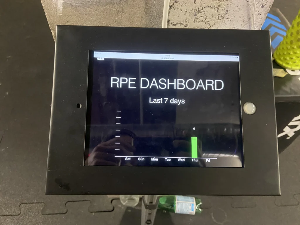
The kiosk wasn’t really athlete-facing. I wanted a quick way to read what was happening at the level of the gym, not the individual.
For a coach, the average RPE of a given WOD is a useful number. If you programmed a session you expected to land around RPE 8 and the average came in at 5, either the prescription was too soft, the scaling was generous, or the population that day skewed strong. If you programmed for 7 and it came in at 9.5, something didn’t go to plan — pacing, scaling, or the work itself.
The week-level view was more useful. A whole week sitting at RPE 4 suggests room to push. A week averaging 9 suggests the opposite. Coaches make those calls anyway, by feel. The kiosk made the underlying signal visible and shared.
Athletes saw the same numbers. That was secondary, but I liked it. It gave them a sense of where the room was sitting and a shared vocabulary for talking about effort that wasn’t tied to load on the bar.
What it told me
A few things that weren’t obvious before there was data:
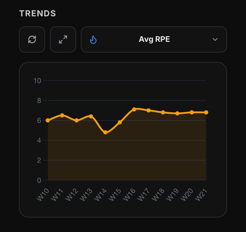
The spread between athletes on the same WOD was wider than I’d expected. Same workout, same time slot — RPE responses across four or five points. A useful reminder that a single prescription is always landing differently on different people.
Aggregate RPE was a leading indicator, not a coincident one. By the time the week’s average had drifted up, the room already felt off. Watching the trend let you respond a session or two earlier than you would have otherwise.
It didn’t replace anything. Coaches still watched bar speed, breakdown in form, recovery between rounds. RPE was a complementary signal that was cheap to collect.
How RPE shows up in Afitpilot
Afitpilot is built for self-coached athletes, so the unit is the individual rather than the gym. RPE plays a similar role at that scale. After each session, the athlete logs how it felt. That input feeds into the next decision the system makes about load, volume and modality balance, alongside completion data and accumulated fatigue across training types.
It’s one indicator among several. Completion rates, dropped sets, accumulated cardio load, the gap between prescribed and reported volume — all of these matter, and each captures something different. RPE is the one that most directly tells you whether the prescription matched the day.
The scale changed between the kiosk and the platform. The function it serves didn’t.
Leave a Reply
You must be logged in to post a comment.